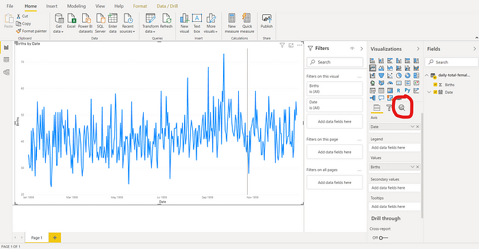
We now see a line graph like the one below. Head over the Visualization panel and under the list of icons, find the analytics icon as shown below.
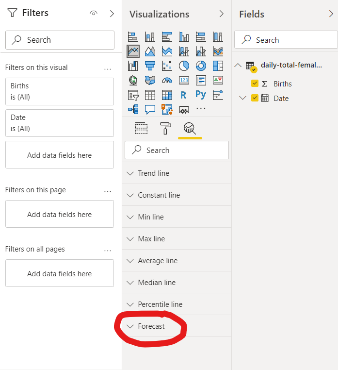
Scroll down the panel and find the “Forecast” section. Click on the down arrow to expand it if necessary.
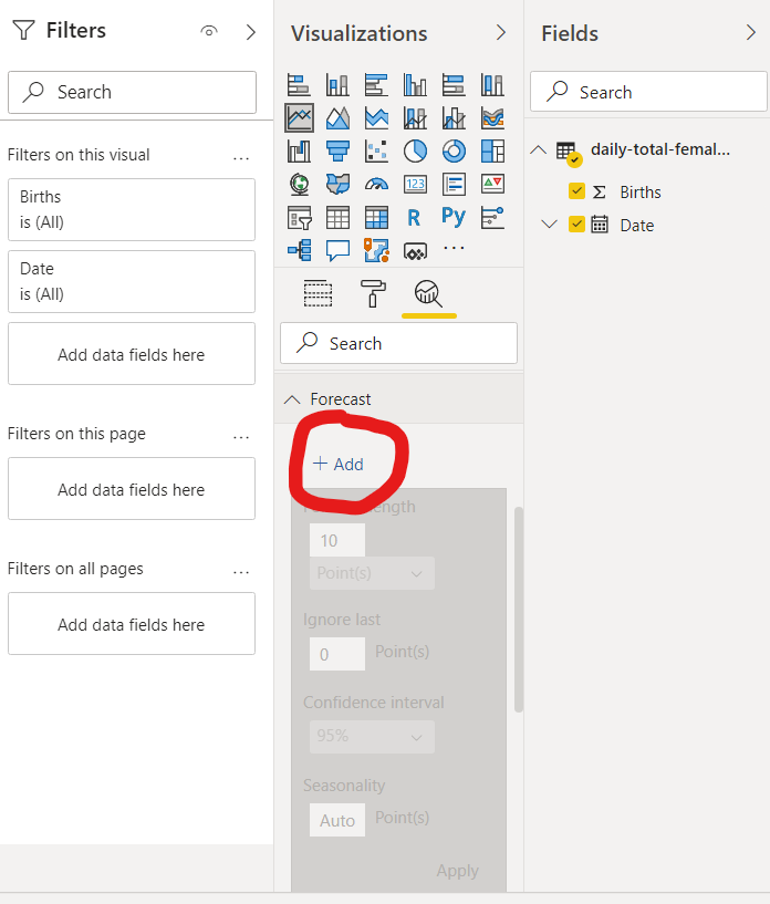
Next, click on “+Add” to add forecasting on the current visualization.
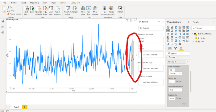
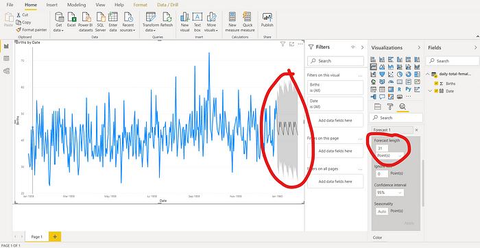
We’ll now see a solid gray fill area and a line plot to the right of the visualization like the one below.
Let’s change the Forecast length to 31 points. In this case, a data point equals a day so 31 would roughly equate to a month’s worth of predictions. Click on “Apply” on the lower right-corner of the Forecast group to apply the changes.
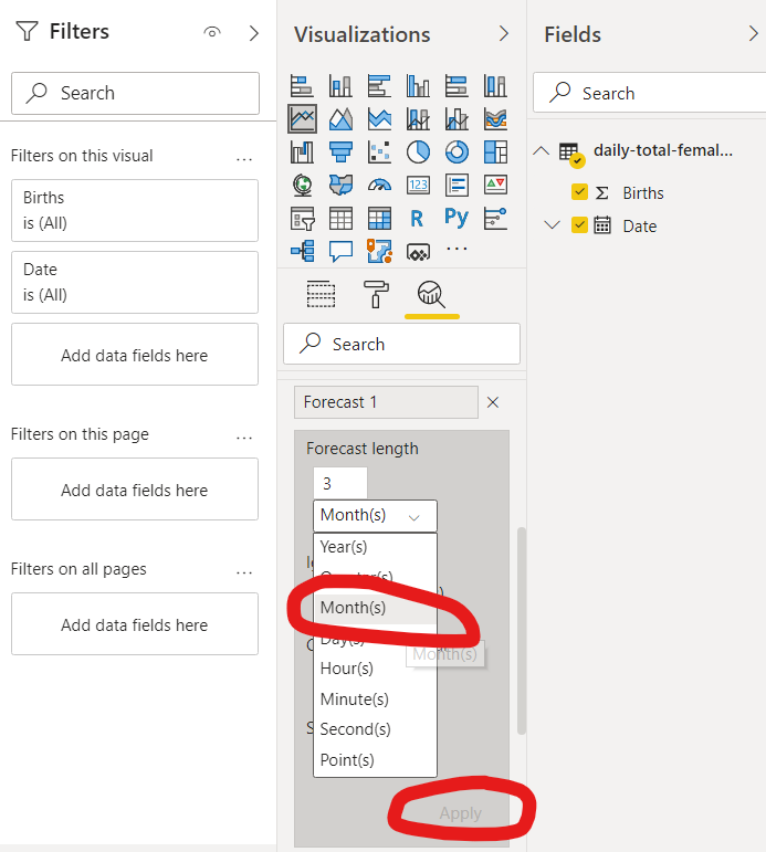
Instead of points, let’s change the unit of measure to “Months” instead as shown below.
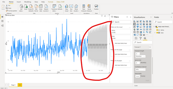
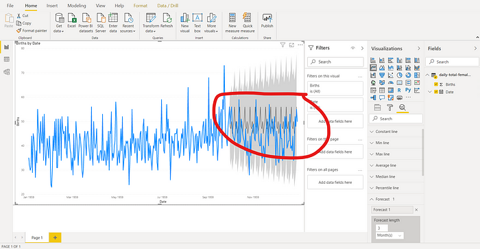
Once we click “Apply,” we’ll see the changes in the visualization. The graph below contains a forecast for 3 months.
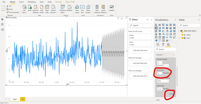
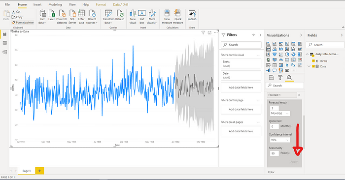
What if we wanted to compare how the forecast compares to actual data? We can do this with the “Ignore last” setting.
For this example, let’s ignore the last 3 months of the data. Power Bi will then forecast 3 months’ worth of data using the dataset but ignoring the last 3 months. This way, we can compare the Power BI’s forecasting result with the actual data in the last 3 months of the dataset.
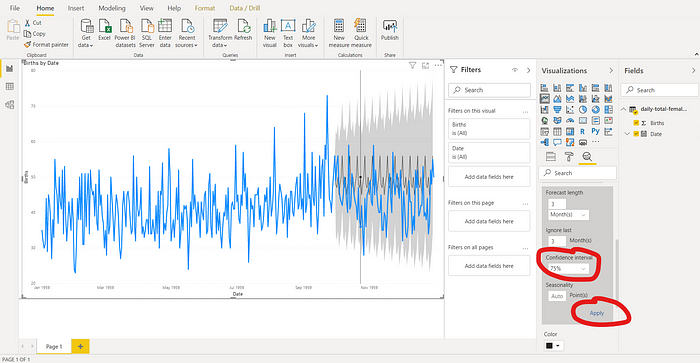
Let’s click on “Apply” when we’re done changing the settings as shown below.
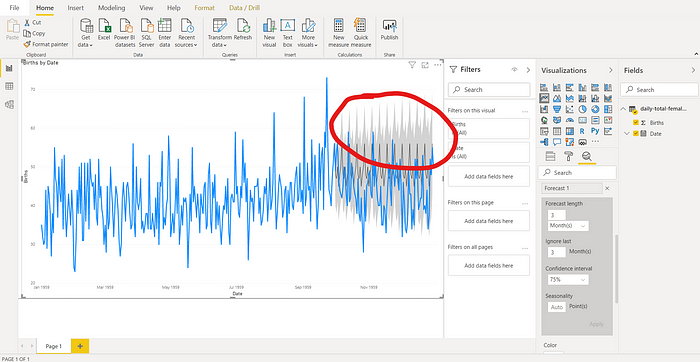
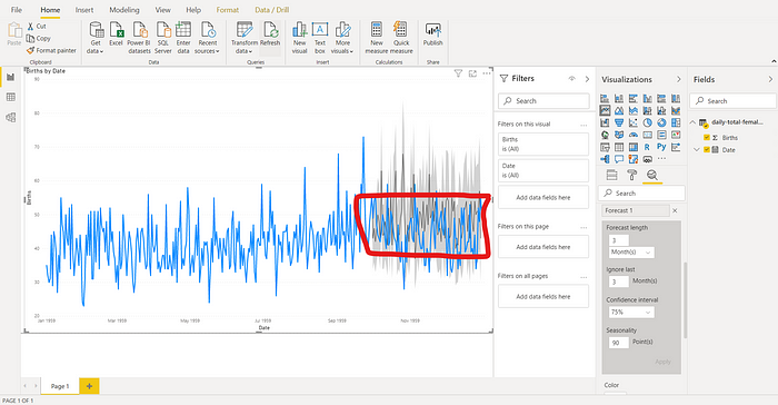
Below, we can see how the Power BI forecasting compares with the actual data. The black solid line represents the forecasting while the blue line represents the actual data.
The solid gray fill on the forecasting represents the confidence interval. The higher its value, the large the area will be. Let’s lower our confidence interval to 75% as shown below and see how it affects the graph.
The solid gray fill became smaller as shown below.
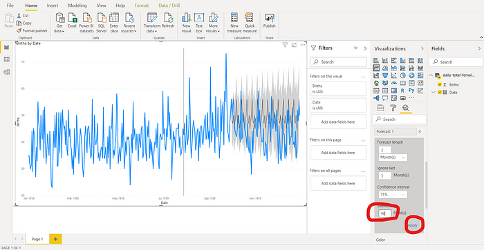
Next, let’s take into account seasonality. Below, let’s set it to 90 points which is equivalent to about 3 months. Putting this value will tell Power BI to look for seasonality within a 3-month cycle. Play with this value with what makes sense according to the data.
The result is shown below.
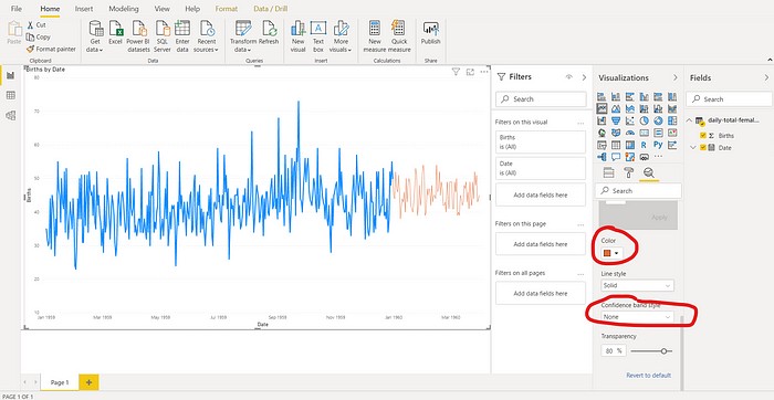
Let’s return our confidence interval to the default value of 95% and scroll down the group to see formatting options.
Let’s change the forecasting line to an orange color and let’s make the gray fill disappear by changing formatting to “None.”
And that’s it! With a few simple clicks of the mouse, we got ourselves a forecast from the dataset.
Ref: https://towardsdatascience.com/forecasting-in-power-bi-4cc0b3568443